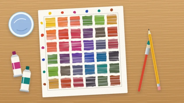
Tints, Tones and Shades: Lightening and Darkening Acrylic Colors
Learn what tints, tones and shades are, why white turns colors chalky and black turns them flat, and how to lighten, darken and mute acrylic colors with neighbors and complements instead.

You need a lighter green, so you add white. You need a darker one, so you add black. It seems logical, yet the light green comes out chalky and the dark one looks dead. Almost every beginner runs into this, and the fix starts with three small words.
Understanding tints, tones and shades gives you more than one way to lighten, darken or quiet a color, so you can pick the method that keeps it alive.
Tint, tone and shade: the definitions
- A tint is a color plus white. Red with white becomes pink.
- A shade is a color plus black or another dark. Red with a dark becomes maroon.
- A tone is a color plus gray, or plus a little of its complement. Red with gray becomes a dusty, muted red.
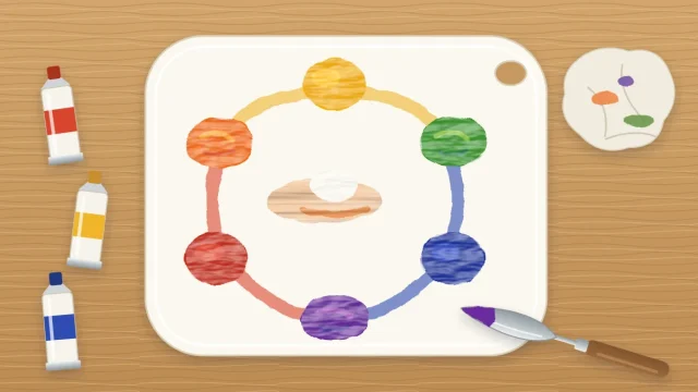
The complement of a color is the one opposite it on the color wheel: red and green, blue and orange, yellow and purple. Mixed together, complements cancel each other toward gray, which is why a touch of one tones down the other.
Tints and shades move a color lighter or darker. Tones mainly change how intense it is. Most colors in a finished painting are a combination, such as a tint that has also been toned.
Value does more work than hue
Value is how light or dark a color is, regardless of what color it is. A pale yellow and a pale blue can share the same value. So can a dark red and a dark green.
Value is what makes a painting readable. A pear looks round because one side is light and the other dark, not because it is green. If the values are right, the object looks solid even when the hues are slightly off. If the values are wrong, no amount of careful color will rescue it.
A quick check is to squint at your subject and your painting. Squinting blurs detail and color and leaves the pattern of lights and darks, so you can compare the two.
The trouble with white
White lightens, but it also cools and dulls. Titanium white is opaque and slightly cool, so each addition pushes a color toward pastel. Red does not become a lighter red. It becomes pink. A warm orange drifts toward a cool peach.
A lot of white also makes colors look chalky, as though seen through a thin film of milk. When every light area in a painting has been made this way, the whole picture can look washed out.
The trouble with black
Black darkens, but it dulls strongly, and it shifts some colors sideways. The best-known case is yellow: add black and you get an olive green, not a dark yellow. Reds turn brownish and flat.
Black is not forbidden. A small amount is useful, and some subjects call for it. The problem is using it as the only way to darken, because shadows made with black tend to look like holes instead of darker versions of the color beside them.
Better ways to lighten, darken and mute
The alternatives rely on neighbors and complements. A neighbor is a color that sits next to yours on the wheel.
| Goal | Try this first | Example |
|---|---|---|
| Lighten | A lighter neighbor, then a little white | Green plus yellow, then a touch of white |
| Darken | A darker neighbor or the complement | Green plus ultramarine blue, or a touch of red |
| Mute | A little of the complement | Bright orange plus a speck of blue |
To lighten red, add a little yellow or a warm orange along with the white. The warmth replaces what white takes away, and you get a light red instead of a cold pink. To lighten blue, white alone usually works well, because blue is already cool.
To darken yellow, use yellow ochre, then burnt sienna or burnt umber. To darken red, use crimson, burnt umber, or a touch of green. To darken green or blue, add ultramarine blue, then a little burnt umber.
Add complements in specks. A small amount mutes the color, and a larger amount darkens it toward a deep neutral. Go too far and you have brown or gray. How each tube behaves in these mixes is covered in the guide to acrylic color mixing with a limited palette.
Tip
Acrylics usually dry slightly darker than they look wet. When a light mix has to match an area that is already dry, test a dab on scrap paper and wait for it to dry before you commit.
A five-step value scale exercise
This exercise trains your eye to judge value. Use acrylic paper or heavy mixed-media paper, a small flat brush, titanium white, black and ultramarine blue.
- In pencil, draw two rows of five squares, each about 1 in (2.5 cm) across.
- In the top row, paint the first square white and the last square black.
- Mix a middle gray that looks halfway between the two and paint the center square.
- Mix a light gray for the second square and a dark gray for the fourth, aiming for even jumps between all five.
- In the bottom row, do the same in blue. Start with a very pale tint on the left and step down to a dark shade on the right, using white to lighten and a touch of black or burnt umber to darken.
- Let both rows dry, then squint. Each blue square should match the value of the gray square directly above it.
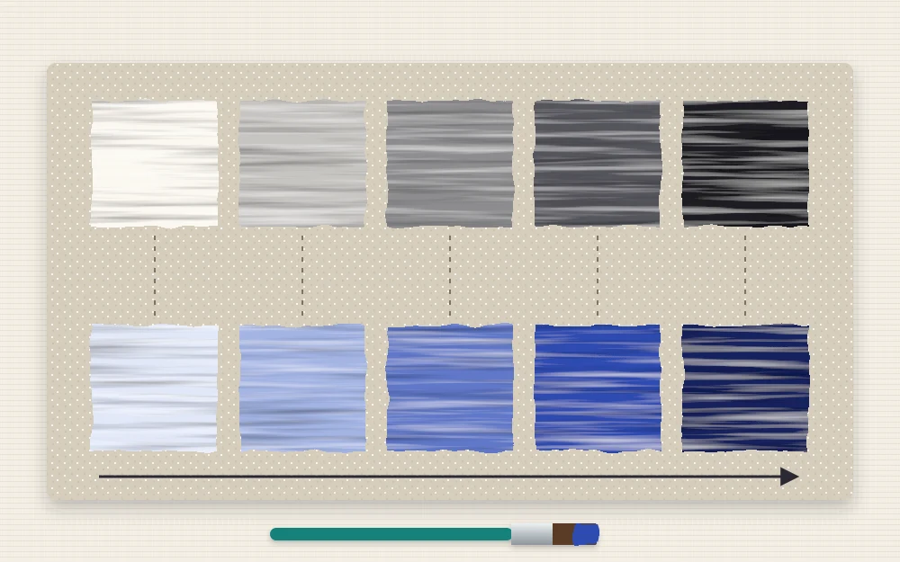
If two neighboring squares look alike, let them dry and repaint one. Uneven steps are normal on a first attempt. Most people make the light end too similar and jump too quickly into the darks.
Putting it to use in a painting
Before you start a painting, decide where the lightest light and the darkest dark will go, then mix a light, a middle and a dark version of each main color. Three values per color are enough to make a simple form look solid.
You can see this approach worked through in the simple still life of one pear, where the whole fruit is built from a light, a middle and a shadow green.
The same thinking applies to backgrounds and skies. A smooth transition from dark to light is just a value scale with the steps blended away, and the guide to painting a gradient in acrylic shows how to do that on canvas.
Frequently asked questions
What is the difference between a tint, a tone and a shade?
A tint is a color mixed with white, so it is lighter. A shade is a color mixed with black or another dark, so it is darker. A tone is a color mixed with gray or a little of its complement, which makes it less intense without necessarily changing how light it is.
How do I darken yellow without it turning green?
Leave black out, because black pushes yellow toward olive green. Darken yellow in stages with yellow ochre, then burnt sienna or burnt umber. For a deeper, more neutral dark yellow, add a tiny speck of purple, its complement, and stop as soon as the color starts to gray.
Should beginners avoid black paint completely?
No. Black is a useful paint, especially in small amounts and for very dark accents. The habit to avoid is reaching for it every time a color needs darkening. Try a darker neighbor or the complement first, and keep black as one option among several.