How to Paint Poppies in Acrylic: Loose Red Flowers Step by Step
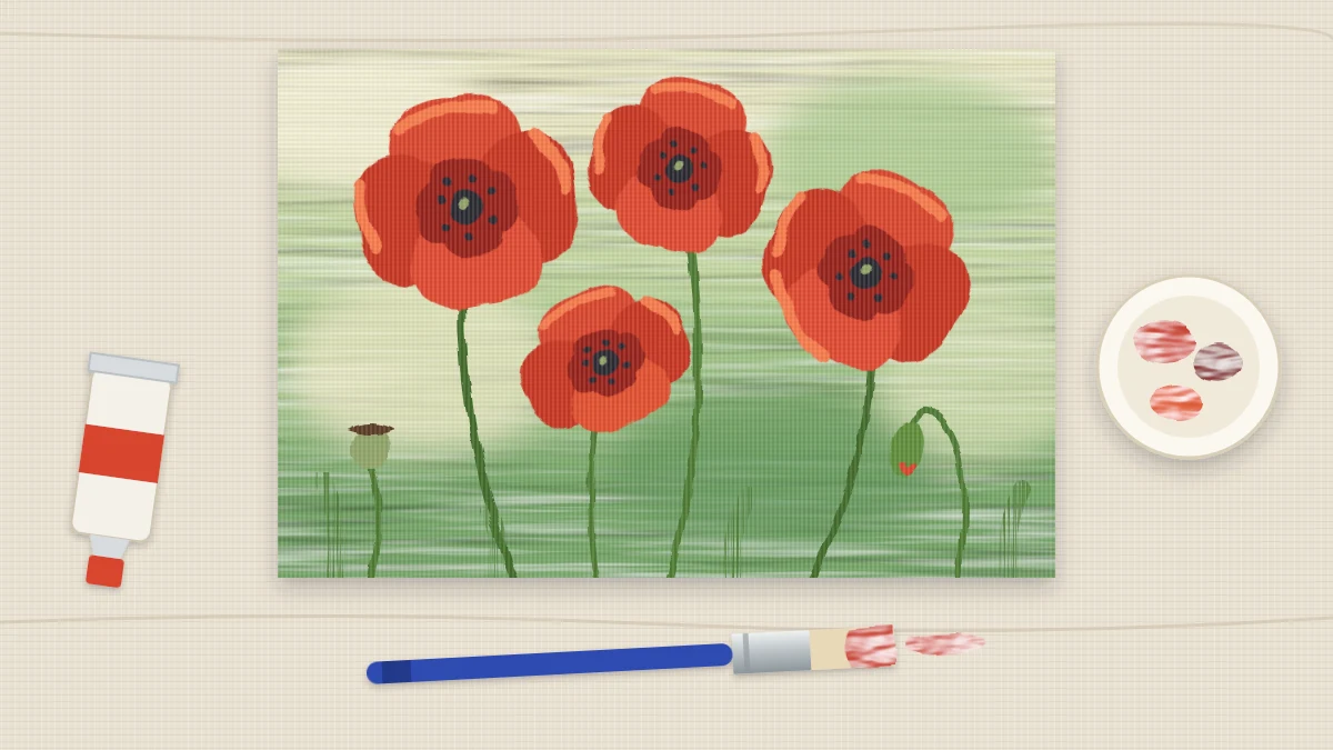
Paint four loose red poppies on a soft green and cream background. Each flower is four broad petals in three reds worked wet, finished with a dark dotted center, curving stems, a bud and seed heads.
At a glance
Brushes and materials
- 1 in flat brush
- Medium flat or filbert brush
- Small round brush
- Liner brush
- Palette and two water jars
- Paper towels
Poppies suit a loose hand. Their petals are thin, crumpled and uneven, so a few broad strokes of red say more than careful outlines ever could. If you want to learn how to paint poppies without fussing over each petal, this is a good subject to relax with.
The painting is four red flowers on thin stems against a soft green and cream background. Most of the work happens in one short session per flower, with three reds worked together while the paint is still wet.
Colors, brushes and surface
Use a canvas panel or stretched canvas, about 9 x 12 in (23 x 30 cm), upright or sideways as you prefer.
- Colors: primary red, crimson, primary yellow, yellow ochre, sap green, ultramarine blue, burnt umber and titanium white.
- Brushes: a 1 in (2.5 cm) flat for the background, a medium flat or filbert for petals, a small round for centers and buds, and a liner for stems.
- Also: a palette, two water jars and paper towels.
Wear old clothes. Red is a strong stainer, and dried acrylic does not wash out of fabric.
Keep the red clean
Red is easy to spoil. Lightening it with white alone gives a cool, chalky pink, and darkening it with black gives a dull brown. Mix three reds before you start and keep them apart on the palette.
| Red | Mix | Where it goes |
|---|---|---|
| Mid red | Primary red on its own | The whole petal shape |
| Dark red | Crimson with a small touch of burnt umber | Toward the center and under overlaps |
| Light warm red | Primary red with primary yellow, plus a speck of white only if needed | Upper petal edges facing the light |
The yellow keeps the light red glowing instead of turning pink. For the reasoning behind mixes like these, the guide to acrylic color mixing goes into warm and cool versions of each color.
Brush in a loose background
- Mix a cream: mostly white with a little yellow ochre.
- Mix a soft green: sap green with white and a touch of yellow ochre. Make a second, slightly darker version with less white.
- Cover the surface with the large flat in short strokes going in every direction: cream mainly in the upper half, greens mainly lower down, letting them merge where they meet.
- Soften the joins with a few light passes while the paint is wet, then stop. Patches and brush marks are welcome here.
- Let it dry until touch-dry, roughly 10 to 20 minutes.
Paint each poppy in four petals
Finish one flower completely before starting the next, because the three reds need to meet while wet. Place the four flowers at different heights, and make them different sizes.
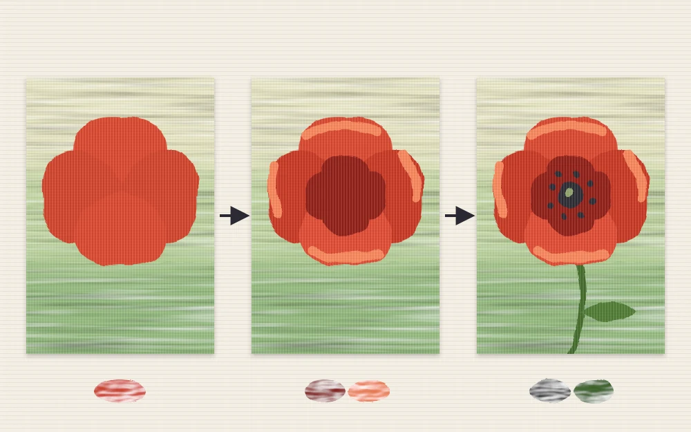
- Lay in four petals. With the medium flat or filbert and mid red, paint four broad, overlapping shapes around an imagined center: two large ones at the back and two in front. Each is a short, curved, fan-like stroke or two. Leave the outer edges wavy.
- Add the dark red. Without rinsing, pick up dark red and stroke it from the center outward about a third of the way along each petal, and along the line where one petal sits under another.
- Add the light warm red. Wipe the brush, pick up the light red and touch it along the upper edges of the petals, pulling a little way in toward the center.
- Blend with a few strokes. Follow the direction of the petal, from edge to center, and leave visible streaks. They read as the creases in the petals.
- Let the flower dry before adding the center.
If the reds dry before you can join them, work on a smaller flower or apply the paint a little more thickly. The guide on how to blend acrylic paint covers ways to keep an edge workable for longer.
Tip
Count your strokes. If you have gone over one petal more than five or six times, move on. Overworked red turns flat and loses the streaks that make the petal look thin.
Centers, stems, a bud and seed heads
Not every poppy faces you. Varying the view, and adding the parts that come before and after the bloom, makes the group look like it is growing.
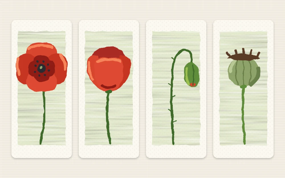
- Dark centers. Mix burnt umber with ultramarine blue for a deep, soft dark. With the small round, dab an uneven oval in the middle of each front-facing flower, then stipple a few dots around its edge. Add two or three tiny dots of yellow ochre on top.
- A side view. For one flower, skip the center. Paint it as a cup: two front petals covering most of the two behind, with dark red at the base where the cup meets the stem.
- Stems. Thin sap green with a little water and a touch of the dark center mix. Pull each stem with the liner in one slow curve from the flower down past the bottom edge. Stems should lean and cross, never stand in parallel.
- A nodding bud. Draw a stem that bends over sharply at the top like a hook. At its tip, press the small round to make an oval in green, and add a sliver of mid red along one side where the petals are beginning to show.
- Seed heads. On two shorter, straighter stems, paint a small round ball in gray-green, made from sap green, white and a touch of the dark mix. Add a flat little cap across the top in a darker green.
Know when to stop
Loose paintings are usually spoiled in the last ten minutes. Step back about six feet (2 m) and look at the whole panel before changing anything.
- If you can tell each flower is a poppy, the petals are done. Do not outline them.
- If a flower looks flat, add a single touch of dark red near the center, not more light.
- If a petal has turned pink or muddy, let it dry and restate it with fresh mid red.
- If the background looks empty, add two or three soft green strokes with a damp brush instead of more flowers.
Where this fits with other flowers
Poppies are cup and disc shapes handled loosely. If you would like to see how the same shapes apply to other blooms, the overview of painting flowers in acrylic from simple shapes sets out the base forms and strokes.
Frequently asked questions
How do I make red lighter without turning it pink?
Add a warm yellow instead of white. Yellow shifts red toward a bright orange-red that still reads as a sunlit petal. If the mix needs to be more opaque, add only a tiny speck of white afterward, since white cools red and makes it chalky.
Why does my red paint look streaky and thin?
Many reds are fairly transparent, so one coat can look patchy over a pale background. For loose poppies some streaking is useful because it suggests creased petals. If you want more coverage, let the first layer dry and add a second rather than piling on wet paint.
What color should poppy centers be?
A soft dark works better than straight black. Burnt umber mixed with ultramarine blue gives a deep, slightly cool dark that sits naturally against red. A few stippled dots around the edge and two or three specks of yellow ochre are enough detail.